Zhaoxin Huijin Center
Shenzhen, China
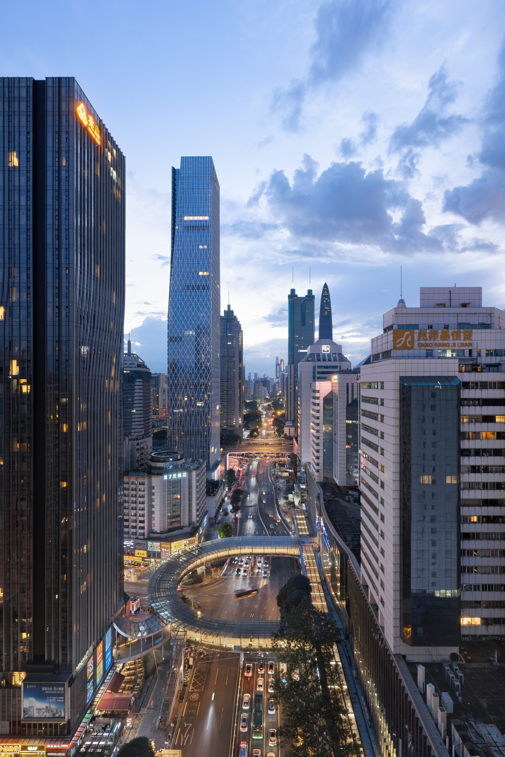
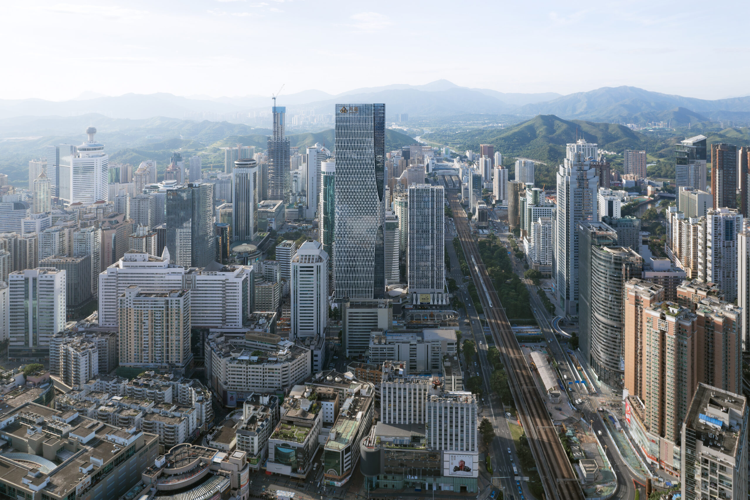
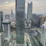
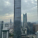
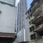
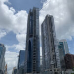
The Zhaoxin Huijin center is located on a golden corner, across the Shennan Avenue and the XXX road, facing the most important Luohu and Shenzhen landmarks, the Diwan building and the KK100. This special condition brought the necessity to create a special design strong enough to balance the iconicity of the surrounding landmark.
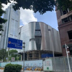
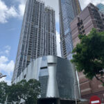
The Zhaoxin H+ is composed by 3 buildings, the Tower A, the Tower B and the Podium. The Tower A, thanks to its height, around 250m, can be considered the landmark tower, connected by the tower B, a high residential building with a more regular design by the Podium, whose design is more commercial oriented.
Tower A
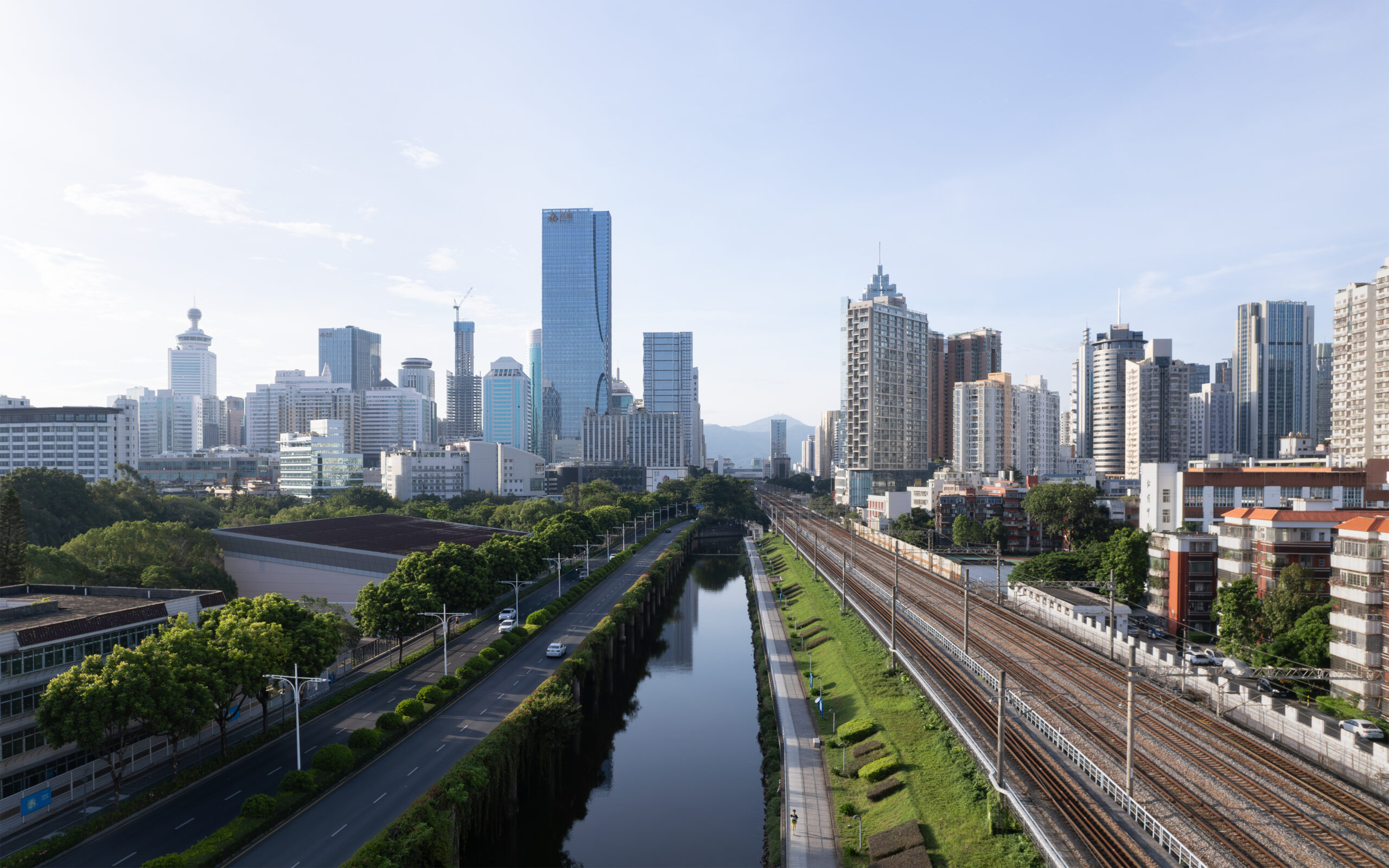
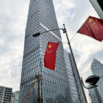
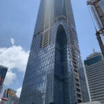
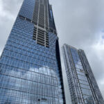
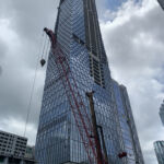
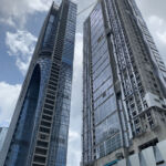
The Landmark tower is a mixed-use building of 261m which has a very strong image given by two main characteristics.
The first one is the oval cuts on the North-West and South-East corners, which consists in large scale oval-shaped facade interruption that makes the facade strongly recognizable from the Shennan Av. which is one of the most important roads of Shenzhen and definitely the main access point to the site. The reason behind the oval cuts is to hide by an organic and smooth gesture (the oval) the not-continuous massing of the tower, which has several setbacks and dis-alignment. The output is a gentle curved line that draw 2 ovals pointing each other to the golden corner, or the middle area of the tower where is located the sky lobby, giving a very special an uncommon image to the building.
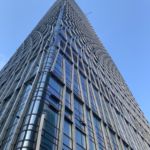
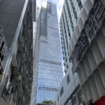
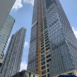
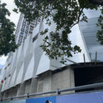
The second key element of the Landmark tower is the decoration pattern that clads it from the bottom to the top. The pattern design comes from a nature-inspired concept in the willing to have a design strongly linked with the city of Shenzhen. In fact, one of the main characteristics of Shenzhen is the gorgeous tropical nature which is everywhere, not only in the parks, but also along the roads and even on the buildings, creating and interesting overlapping between landscape and architecture. As the mangrove branches hit by the sun rays, the pattern design would like to recreate the mangroves branches interlacement which is random, but with its own order, and so able to filter the sun light reflecting the pattern design in the interiors with interesting shadow play effects. The patter, in fact, is not regular form bottom to top, but it starts like a straight low-density grid with large modules to gradually become a high-density diamond-shaped pattern getting closer to the tower mid-point where is located the sky lobby and the become straight again to the tower top. This dynamic articulation goes together with the tower shaping, making natural the transition between the typical floors on bottom and top of the building and central-height part which has a larger footprint. The final output is a facade that has a consistent and continuous language, but at the same, creates several shadows and lights effects, reflecting differently the sun light according to the various pattern design.
Tower B
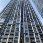
Thanks to a system of straight lines that envelop the entire building, Tower B is a sober, elegant and well-designed residential building. Also, because the existing defined floor layouts leads to a scatter of the south façade, this unique façade system with the strong straight lines create a greater sense of coherence and regularity. In terms of overall effect and final output, the key element is the cladding with the same shining reflective materials that are also used on the Tower A and the Podium. And the characteristics by using different triangular metal panels with different inclination is about creating different reflective effect, like the shiny diamond.
Podium
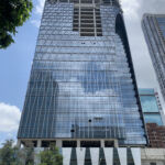
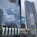
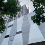
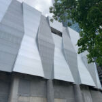
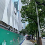
As the connection of the 2 towers, and the element that unifies the entire complex, podium used the same language with the 2 towers. The rhombus shape pattern is a response to the mangrove branch pattern in tower A and diamond shaped cladding in Tower B. The repeating use of the modules with the same language, the graduate changing module thickness, and the alternate glass and anodized aluminum that is high reflected, made the commercial feelings here enhanced. The high light is the oval element that connect the landscape, sunken plaza umbrella canopy, podium ceiling, and the roof pavilions, which has different functions, scales and typologies, as an entirety. Moreover, the oval language is also a response to the oval cut in Tower A facades.
Related projects


